Controls are often the target of various data-binding operations. Simply put, data binding is the act of connecting control properties to data values that might change over the course of your application’s lifetime. Doing so lets a user interface element display the state of a variable in your code. For example, you might use data binding to accomplish the following:
When you use the intrinsic WPF data-binding engine, you must be aware of the distinction between the source and the destination of the binding operation. As you might expect, the source of a databinding operation is the data itself (e.g., a Boolean property or relational data), while the destination (target) is the UI control property that uses the data content (e.g., a CheckBox or TextBox).
Truth be told, using the WPF data-binding infrastructure is always optional. If you were to roll your own data-binding logic, the connection between a source and destination typically would involve handling various events and authoring procedural code to connect the source and destination. For example, if you had a ScrollBar on a window that needed to display its value on a Label type, you might handle the ScrollBar’s ValueChanged event and update the Label’s content accordingly.
However, you can use WPF data binding to connect the source and destination directly in XAML (or use C# code in your code file) without the need to handle various events or hard-code the connections between the source and destination. Also, based on how you set up your data-binding logic, you can ensure that the source and destination stay in sync if either of their values changes.
Using the Objects and Timeline editor, change the Grid of your third tab to a StackPanel. Now, use the Assets Library and the Properties editor of Blend to build the following initial layout:
<TabItem x:Name="tabDataBinding" Header="Data Binding">
    <StackPanel Width="250">
        <Label Content="Move the scroll bar to see the current value"/>

        <!-- The scrollbar's value is the source of this data bind -->
        <ScrollBar x:Name="mySB" Orientation="Horizontal" Height="30"
            Minimum = "1" Maximum = "100" LargeChange="1" SmallChange="1"/>

        <!-- The label's content will be bound to the scroll bar! -->
        <Label x:Name="labelSBThumb" Height="30" BorderBrush="Blue"
            BorderThickness="2" Content = "0"/>
    </StackPanel>
</TabItem>
Notice that the <ScrollBar> object (named mySB here) has been configured with a range between 1 and 100. The goal is to ensure that, as you reposition the thumb of the scrollbar (or click the left or right arrow), the Label will automatically update with the current value.
The glue that makes it possible to define a binding in XAML is the {Binding} markup extension. If you wish to establish a binding between controls using Blend, you can do so easily. For this example, locate the Content property of the Label object (in the Common Properties area of the Properties window) and click the (very) small white square next to the property to open the Advanced Property options. From here, select Data Binding (see Figure 28-44).
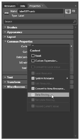
Figure 28-44
You are interested in the Element Property tab here because this will give you a list of all items in your XAML file, which you can select as the source of the data-binding operation. Select this tab, and in the Scene elements list box, find your ScrollBar object (named mySB). In the Properties list box, find the Value property (see Figure 28-45). Click the OK button once you do this.
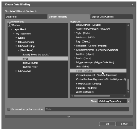
Figure 28-45 Selecting the source object and the property on the object
If you run your program again, you will find that the content of the label updates as you move the thumb! Now look at the XAML the data binding tool generated on your behalf:
<Label x:Name="labelSBThumb" Height="30" BorderBrush="Blue" BorderThickness="2"
    Content = "{Binding Value, ElementName=mySB, Mode=Default}"/>
Note the value assigned to the Label’s Content property. Here, the ElementName value represents the source of the data-binding operation (the ScrollBar object), while the first item after the Binding keyword (Value) represents (in this case) the property of the element to obtain.
If you have worked with WPF data binding previously, you might expect to see the use of the Path token to set the property to observe on the object. For example, the following markup would also update the Label correctly:
<Label x:Name="labelSBThumb" Height="30" BorderBrush="Blue"
    BorderThickness="2" Content = "{Binding Path=Value,
    ElementName=mySB, Mode=Default}"/>
By default, Blend omits the Path= aspect of the data-binding operation unless the property is a subproperty of another object (e.g., myObject.MyProperty.Object2.Property2).
You can define a data-binding operation in XAML using an alternative format, where it is possible to break out the values specified by the {Binding} markup extension by explicitly setting the DataContext property to the source of the binding operation, as follows:
<!-- Breaking object/value apart via DataContext -->
<Label x:Name="labelSBThumb" Height="30" BorderBrush="Blue"
    BorderThickness="2"
    DataContext = "{Binding ElementName=mySB}"
    Content = "{Binding Path=Value}" />
In the current example, the output would be identical if you were to modify the markup in this way. Given this, you might wonder when you would want to set the DataContext property explicitly. Doing so can be helpful because sub-elements can inherit its value in a tree of markup.
In this way, you can easily set the same data source to a family of controls, rather than having to repeat a bunch of redundant "{Binding ElementName=X, Path=Y}" XAML values to multiple controls. For example, assume you have added a new Button to the <StackPanel> of this tab (you’ll see why it is so large in just a moment):
<Button Content="Click" Height="140"/>
You could use Blend to generate data bindings for multiple controls, but instead try entering the modified markup manually using the XAML editor:
<!-- Note the StackPanel sets the DataContext property -->
<StackPanel Width="250" DataContext = "{Binding ElementName=mySB}">
    <Label Content="Move the scroll bar to see the current value"/>

    <ScrollBar Orientation="Horizontal" Height="30" Name="mySB"
        Maximum = "100" LargeChange="1" SmallChange="1"/>

    <!-- Now both UI elements use the scrollbar's value in unique ways. -->
    <Label x:Name="labelSBThumb" Height="30" BorderBrush="Blue" BorderThickness="2"
        Content = "{Binding Path=Value}"/>

    <Button Content="Click" Height="200"
        FontSize = "{Binding Path=Value}"/>
</StackPanel>
Here, you set the DataContext property on the <StackPanel> directly. Therefore, as you move the thumb, you see not only the current value on the Label, but also see the font size of the Button grow and shrink accordingly, based on the same value (see Figure 28-46 shows for one possible output).
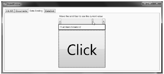
Figure 28-46 Binding the ScrollBar value to a Label and a Button
The ScrollBar type uses a double to represent the value of the thumb, rather than an expected whole number (e.g., an integer). Therefore, as you drag the thumb, you will find various floating-point numbers displayed within the Label (e.g., 61.0576923076923). The end user would find this rather unintuitive because he is most likely expecting to see whole numbers (e.g., 61, 62, and 63).
If you wish to convert the value of a data-binding operation into an alternative format, you could create a custom class that implements the IValueConverter interface of the System.Windows.Data namespace. This interface defines two members that allow you to perform the conversion to and from the target and destination (in the case of a two-way data binding). Once you define this class, you can use it to qualify further the processing of your data-binding operation.
Assuming that you wish to display whole numbers within the Label control, you can build the following class using Expression Blend. Activate the Project > Add New Item menu and insert a class named MyDoubleConverter. Next, add the following:
class MyDoubleConverter : IValueConverter
{
    public object Convert(object value, Type targetType, object parameter,
        System.Globalization.CultureInfo culture)
    {
        // Convert the double to an int.
        double v = (double)value;
        return (int)v;
    }

    public object ConvertBack(object value, Type targetType, object parameter,
        System.Globalization.CultureInfo culture)
    {
        // You won't worry about "two way" bindings
        // here, so just return the value.
        return value;
    }
}
The Convert() method is called when the value is transferred from the source (the ScrollBar) to the destination (the Text property of the TextBox). You receive many of incoming arguments, but you only need to manipulate the incoming object for this conversion, which is the value of the current double. You can use this type to cast the type into an integer and return the new number.
The ConvertBack() method will be called when the value is passed from the destination to the source (if you have enabled a two-way binding mode). Here, you simply return the value straightaway. Doing so lets you type a floating-point value into the TextBox (e.g., 99.9) and have it automatically convert to a whole number value (e.g., 99) when the user tabs off the control. This “free” conversion happens due to the fact that the Convert() method is called again, after a call to ConvertBack(). If you were simply to return null from ConvertBack(), your binding would appear to be out of sync because the text box would still be displaying a floating-point number!
With this class in place, you are ready to register your custom converter with any control that wishes to use it. You could accomplish this exclusively in XAML; however, to do so, you would need to define some custom object resources, which you will not learn how to do until the next chapter. For now, you can register your data conversion class in code. Begin by cleaning up the current definition of the <Label> control in your data binding tab, so that it no longer uses the {Binding} markup extension:
<Label x:Name="labelSBThumb" Height="30" BorderBrush="Blue"
    BorderThickness="2" Content = "0"/>
In your window’s constructor, call a new private helper function called SetBindings(). In this method, add the following code:
private void SetBindings()
{
    // Create a Binding object.
    Binding b = new Binding();

    // Register the converter, source and path.
    b.Converter = new MyDoubleConverter();
    b.Source = this.mySB;
    b.Path = new PropertyPath("Value");

    // Call the SetBinding method on the Label.
    this.labelSBThumb.SetBinding(Label.ContentProperty, b);
}
The only part of this function that probably looks a bit off is the call to SetBinding(). Notice that the first parameter calls a static, read-only field of the Label class named ContentProperty.
As you will learn about in Chapter 31, you are specifying what is known as a dependency property. For the time being, just know that when you set bindings in code, the first argument will nearly always require you to specify the name of the class that wants the binding (the Label, in this case), followed by a call to the underlying property with the -Property suffix (again, you’ll learn more about this in Chapter 31). In any case, running the application illustrates that the Label only prints out whole numbers.
You have built an interesting example so far using nothing but Expression Blend. For the remainder of this project, however, you will use Visual Studio 2010, which will give you some firsthand experience regarding how Blend and Visual Studio can work hand-in-hand. So, save your project and close down Blend. Next, open the same project in Visual Studio 2010 using the File > Open > Project/Solution... menu option.
The previous data-binding example illustrated how to configure two (or more) controls to participate in a data-binding operation. While this is helpful, it is also possible to bind data from XML files, database data, and in-memory objects. To complete this example, you will design the final tab of your tab control, so it displays data obtained from the Inventory table of the AutoLot database.
As with the other tabs, you begin by changing the current Grid to a StackPanel. Do this by directly updating the XAML using Visual Studio. Now define a DataGrid control in your new StackPanel named gridInventory:
<TabItem x:Name="tabDataGrid" Header="DataGrid">
    <StackPanel>
        <DataGrid x:Name="gridInventory" Height="288"/>
    </StackPanel>
</TabItem>
Next, reference the AutoLotDAL.dll assembly you created in Chapter 23 (where you used the Entity Framework), as well as System.Data.Entity.dll. You will use the Entity Framework, so you need to ensure that your project has the required connection string data in an App.config file. You should probably begin by copying the App.config file from your AutoLotEDM_GUI project from Chapter 23 into this project using the Project > Add Existing Item menu option.
Open the code file for your window and add a final helper function called ConfigureGrid();make sure you call this from your constructor. Assuming that you did import the AutoLotDAL namespace, all you need to do is add a few lines of code:
private void ConfigureGrid()
{
    using (AutoLotEntities context = new AutoLotEntities())
    {
        // Build a LINQ query that gets back some data from the Inventory table.
        var dataToShow = from c in context.Inventories
        select new { c.CarID, c.Make, c.Color, c.PetName };
        this.gridInventory.ItemsSource = dataToShow;
    }
}
Notice that you do not directly bind context.Inventories to the grid’s ItemsSource collection; instead, you build a LINQ query that appears to ask for the same data in the entities. The reason for this approach: The Inventory object set also contains additional EF properties that would appear on the grid, but which don’t map to the physical database.
If we were to run the project as-is, you would see an extremely plain grid. To make the grid a bit less of an eye sore, use the Visual Studio 2010 Properties window to edit the Rows category of the DataGrid. At a minimum, set the AlternationCount property to 2 and pick a custom brush using the integrated editor for the AlternatingRowBackground and RowBackground properties (see Figure 28-47 for some possible values).
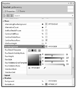
Figure 28-47 Applying some eye candy to the grid
You can see the final tab for this example in Figure 28-48.
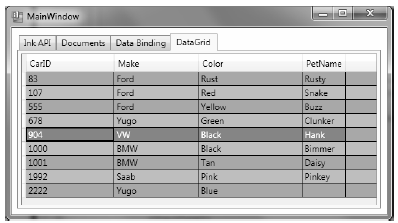
Figure 28-48 The final tab of your project
To be sure, you can configure the WPF DataGrid in a huge number of ways, so you’ll want to consult the .NET Framework 4.0 SDK for details. For example, you can build custom data templates for the DataGrid using WPF graphical types; this enables you to provide an extremely rich UI.
That wraps up the current example. You’ll use some other controls in later chapters; at this point, however, you should feel comfortable with the process of building UIs with Blend, Visual Studio 2010, and manually using XAML and C# code.